
Logging in.
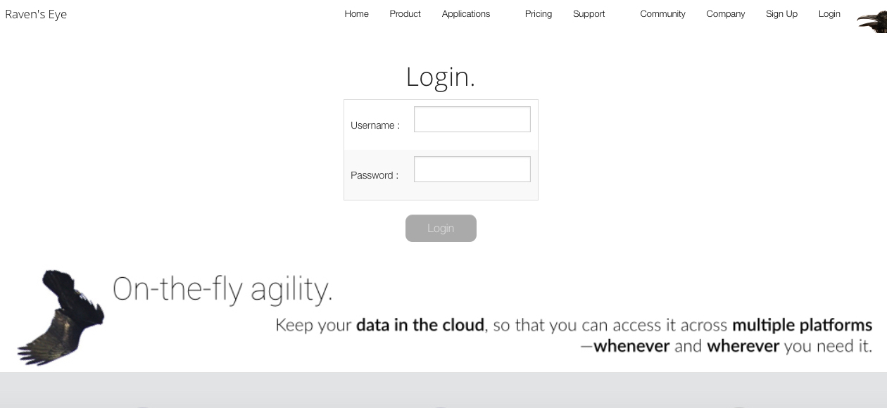
To log in to Raven’s Eye, navigate to the Login page by selecting it from the menu at the top of this or any external webpage, or by selecting this link. Based on whether or not your computer is accessible to others, you may want to add the Login page to your browser’s bookmarks or favorites, so that you can go directly to it in the future.
Once you have arrived at the Login page, enter into the appropriately labeled boxes the username and password that you created when you registered your account. After doing this, click on the Login button.
You have now logged in to Raven’s Eye. If this is your first time logging in, or if you otherwise have no projects uploaded to Raven’s Eye, you will be taken to the Select a project to upload page. If you have previously uploaded one or more projects to Raven’s Eye, you will be taken to the Select a project to analyze page.

The specific features presented on the Select a project to upload page are described in detail in the Uploading your data page of these Practicals, while the specific features of the Select a project to analyze page are described in detail in the Working with previously uploaded projects page of these Practicals.
No matter which page you are directed to upon logging in, you are introduced to two general aspects of the Raven’s Eye software program: the menu bar and the main window.
Menu bar.
After logging in, a menu bar will appear at the top of your browser. We keep it straightforward to facilitate direct access to your data, and to reduce inadvertent interpretive influence.
As long as you are logged in to Raven’s Eye, the menu bar will remain at the top of your browser window, though the options presented in the white area of the menu adapts based on your current activity. These options are described later in this and subsequent pages of these Practicals.
On the right-hand side of the menu bar are some moving cogs. Clicking on them reveals a dropdown menu. This dropdown menu is accessible from every internal page of Raven's Eye.

In this menu are the following options:
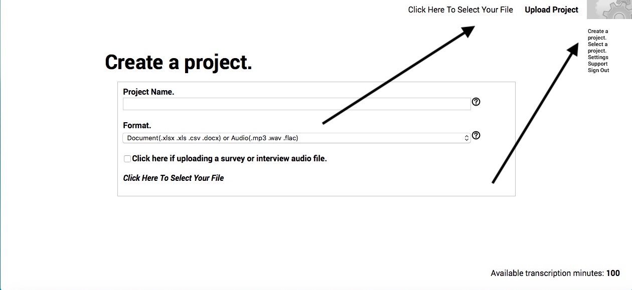
Create a project. By clicking on the Create a project link, you will be taken to the Create a project page, on which you’ll be allowed to upload data and create a new project for analysis. Clicking this link closes your current analysis, and saves it as-is. The Create a project page is further explained in the Uploading your data page of these Practicals.
Select a project. By clicking on the Select a project link, you will be taken to the Select a project page, on which you’ll be allowed to select to open one of your currently uploaded projects. Clicking this link closes your current analysis, and saves it as-is. The Select a project page is further explained in the Working with previously uploaded projects page of these Practicals.
Settings. By clicking on the Settings link, you will be take to the Settings page, on which you'll find:
- a dropdown menu that allows you to select the corpus that you want to use in analysis;
- a dropdown menu that allows you to select between default chart types for your main chart
- a numeric entry box that allows you to adjust the lower limits of word frequency to be included in your analysis;
- a radio button that allows you to select whether or not to combine qualitative columns (i.e., those columns that you've classified as responses according to the procedures described in the Classifying your columns page of these Practicals);
- A switch and corresponding numeric entry boxes that allow you to manually set the main chart's height and major axis lines; and
- Notation of the amount of transcription minutes available to you, as well as a link to purchase more.

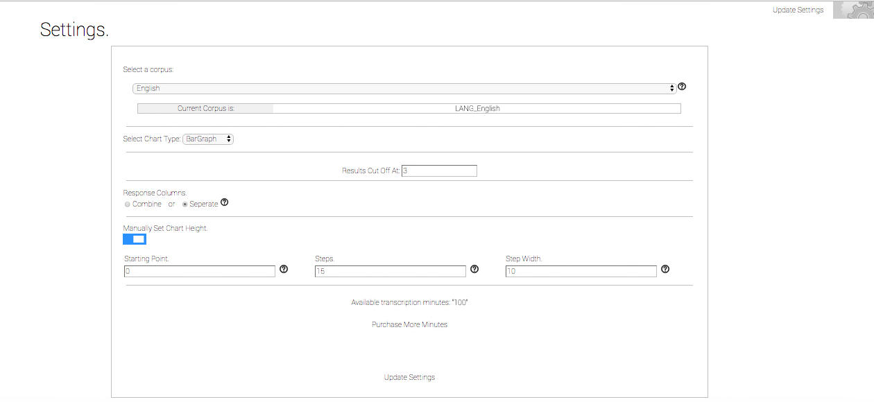
Select a corpus: This dropdown menu allows you select the corpus to use as your background corpus in your analysis. Click on the dropdown menu to reveal 65 language- and other media-based corpora from which you may choose for textual analysis. Nine of these 65 languages also permit the automatic transcription of audio files containing spoken words.
Current corpus is: The corpus that you are currently using as your background comparison corpus is listed here. Prior to uploading data, this corpus must match the spoken language in your audio file, or the written language in your spreadsheet, document, or website. By default, the current corpus is set to English.
Select chart type: In this dropdown menu, you can select between two charts as the default chart-type: an explorable bubble chart and a bar chart. The explorable bubble chart compares word overrepresentation (along the x-axis), word proportion (along the y-axis) and frequency (depicted by bubble size). The bar chart presents the 50 most frequent words in descending order along the x-axis and each word's overrepresentation along the y-axis.
Results cut off at: This numeric entry box allows you to select a floor, or lower limit, of word frequency to be included in the analysis and results. The number in the box signifies the threshold for analysis, and designates the lowest frequency of word occurrence in the sample to be included in the analysis.
This function reduces processing time for your dataset. If you experience a delay in processing, this setting may be of help. It is designed primarily to eliminate the unnecessary and time-consuming process of analyzing non-textual data inadvertently remaining in your otherwise textual dataset. Such non-textual data result in delayed processing time due to unnecessarily extended searching of the background corpus (which—depending on the language selected—is comprised of millions to billions of words).
In larger (10,000 rows or greater) datasets derived from multi-source or hand-copied data, this processing delay can impede the efficient delivery of your results, as well as lead to inaccurate analysis and interpretation. Such non-textual data may include removal-resistant hidden code, email or html links, or script operator symbols sometimes accidentally inserted during the acquisition of data by the user, their database, their respondents, or their spreadsheet program. If your data contain an inordinate amount of misspellings, typos, or other special characters not typically found in your selected language's written text, this may also produce delays in processing time.
Most users will find successful results upon cleaning their data according to the few steps previously described in the Preparing your Data section of these Practicals, and will not then need to adjust the default cut off level setting. However, those subscribers with multi-source or hand-copied datasets of approximately 10,000 rows or greater, and who are not governmental organizations or professional call centers or polling organizations experienced with filtering Big Data sets, should increase the default setting of the cut off level prior to running their initial data analysis. We recommend increasing the cut off level to a frequency of 5 - 10 words, and then adjusting downward at any time should better resolution of relatively infrequent responses be required.
Response Columns: These radio buttons allow you select whether or not to separately analyze those columns that you classified as responses, or to combine them together for analysis. Selecting Combined causes Raven's Eye to treat all the columns that you classified as responses as one pool of words, while selecting Separate treats each column as a separate sample of words.
Manually Set Chart Height: This switch is disabled by default, and therefore allows the scale of the y-axis (vertical axis) of the main chart to be automatically generated according to the overrepresentation of the words listed. Clicking this switch allows editing of the Starting Point, Steps, and Step Width boxes, which in turn permit you to manually set the scale of the main chart's y-axis. The Starting Point box sets the Overrepresentation at which the x-axis (horizontal axis) crosses the y-axis. The Steps box contains the number of major axis lines or demarcations to be noted on the y-axis of the main chart. The Step Width box contains the range of Overrepresentation contained within each set of major axis or demarcation lines.
Available transcription minutes: This informational item displays the number of transcription minutes that you have left in your current balance. To replenish this balance, select the phrase following this item: Purchase More Minutes.
Purchase more minutes: Selecting this phrase takes you to a page on which you may purchase more minutes of automated transcription.
Update settings: Clicking on this button in either of its locations in the upper right-hand corner, or at the center bottom of the page, will update any changes made to your settings and automatically return you to either the Select a project page, or the Create a project page, depending on whether or not you have previously saved projects.
Support. By clicking on the Support link, you will be taken to our main Support page, which contains links to our FAQs, Technicals, and Tutorials, as well as these Practicals. Clicking the Support link closes your current analysis, and saves it as-is. If you are analyzing a project and want to keep your analysis open while accessing support, right-click (or command-click) this link to open it in a new and separate browser tab.
Sign Out. Click on the Sign Out link to log out of Raven’s Eye (you will be taken to our login page). If you are using a computer that someone else can access, we recommend that you treat your account as you would your bank account, and quit or completely close out your browser after logging out. The signing out processes is further explained in the aptly titled Signing out page of these Practicals.
Main window.
Our main window keeps things efficient, non-biasing, and user-friendly, so that your focus remains on what’s important to you: your results, instantaneously. Because of this, and like our menu bar, our main window is adaptive, and presents information on an as-needed basis as you progress through successive levels of analysis.
On pages concerned with uploading, accessing, classifying, or reclassifying your data, the main window focuses on the task at hand, and presents information in readily understandable formats. The content, choices, and options presented on these pages are described in the Uploading your data, Classifying your columns, Working with previously uploaded projects, and Exporting your results pages of these Practicals.
In the few seconds it takes to arrive at your results, your main window will display them in the form of interactive tables. These tables are easily downloadable for rapid conversion into spreadsheet generated charts and graphs. Like our menu bar and main window, our tables are adaptive, and present information based on the particular variables and responses that you’ve selected for analysis. The content and options presented on these tables, as well as the formulas underlying them, are described in the Understanding your results, and Comparing your variables pages of these practicals.