
Understanding your results.
Main chart.
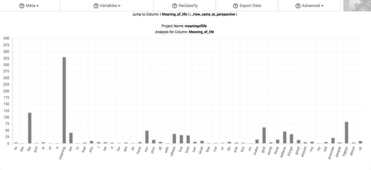
The first thing you may notice upon receiving your results is the main chart. This chart is designed to help you get a sense of the whole by identifying the gists in your responses. If you have uploaded spreadsheet data, a chart is produced for every response column in your project. In this case, selecting the column's label at the top of the page (after the phrase, "Jump To:") will cause your browser window to quickly scroll downward until the chart for the subsequent response column is reached.
The Settings page allows you to select between displaying either a bar chart or a bubble chart, and to determine other features of your chart. Both charts are preceded by the project name and name of the column being analyze.
Project Name: is the name assigned to the project currently being analyzed when it was last uploaded to Raven's Eye.
Analysis for Column: designates the name of the column being analyzed. This is derived from the label that as assigned to your columns when classifying your columns.
Bar chart.
X-axis. Along the x-axis (or horizontal axis) are the 50 most frequent words in your response pool. These words are rank ordered according to decreasing frequency.
Y-axis. The hash lines and numbers along the y-axis (or vertical axis) of the chart demarcate various degrees of overrepresentation (see discussion on the fifth column of the main table, below). By default, the scale of this chart depends upon the range of overrepresentation displayed among the 50 most frequent words in your response pool. However, you can also manually adjust the scale of the y-axis in the Settings page.
Right-click this chart to download it to your computer as an image.

Bubble chart.
X-axis. The hash lines and numbers along the x-axis (or horizontal axis) of the chart denote the overrepresentation of the word in the sample word pool, and is therefore the ratio resulting from the word's proportion in the sample divided by the word's proportion in the comparison corpus. By default, the scale of this chart along this access is determined by the range of proportionality displayed among the words in your response pool. However, you can manually zoom to specific sections along this access for further visual inspection.
Y-axis. The hash lines and numbers along the y-axis (or vertical axis) of the chart mark the proportion (in percent) of the word pool constituted by the word. By default, the scale of this chart along this access is determined by the range of proportionality displayed among the words in your response pool. However, you can manually zoom to specific sections along this access for further visual inspection.
Bubble size. The size of the bubbles are differentiated according to the absolute frequency of the given word in the sample.

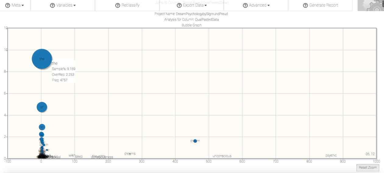
Exploration. You can select specific areas of the bubble chart to expand, in order to assist in the visual inspection of distribution patterns. To do so, click in the chart area and drag diagonally, such that a rectangle appears. Continue to hold your selection while you fit the rectangle to to area that you'd like to expand. Releasing the selection will cause the graph to zoom to the selected area. To reset the zoom, click on the aptly named Reset Zoom button to the lower right-hand corner of the graph.
Right-click this chart to download it to your computer as an image.
Message at a glance.
Beneath the main chart is an area labeled Message at a Glance. In this area are listed the most frequent words in your response set, in prose format. As with the main chart, this area is designed to facilitate a sense of the whole through identification of various gists and their elaboration into concepts via inflections and synonyms. Depending on the specificity of the stimulus eliciting the response being analyzed, popular phrases and sentences may already be apparent in this section, which will eventually comprise your revelatory themes and essential structure.
Revelatory statements.
Following the Message at a Glance section is a section labeled Revelatory Statements. This section lists those phrases containing the highest density of overrepresented word relations. As such, these statements reveal how words, concepts, and themes are related in their actual use by your participants (or in your cases, or documents). Differential overrepresentation is represented by font size, with larger font depicting greater overrepresentation. Variation in the ordering and connection of words in these statements likely indicates similar variation in the word pool as a whole.
Main table.
Your results are initially displayed in a table containing 5 columns. The table will, by default, arrange data according to the proportion of the sample that each word comprises, which is displayed in the third column. Columns can be re-sorted by clicking on the title of a column.
The first column is entitled Word. This column lists each and every word in your data set.
The second column, # Sample, identifies the number of times (or frequency) that each specific word is found in your sample.
The third column, % Sample, identifies the proportion of the sample accounted for by each and every word in the sample, displayed as a percentage. Therefore, numbers to the right of the decimal indicate fractions of one percent. By default, this column orders all of the data presented in the table. It is arranged in descending order.
The fourth column, % Corpus, identifies the proportion of the background comparison corpus accounted for by each and every word in the sample, converted to percent. As with the third column, in this column numbers to the right of the decimal indicate fractions of a percent.

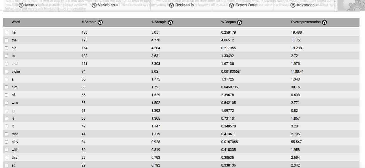
The fifth column, Overrepresentation, is the quotient resulting from dividing the third column (% Sample) by the fourth column (% Corpus), and represents the degree to which each given word is overrepresented in your sample, based on the proportion of that given word in the background comparison corpus. For instance, if “1.0” appears in this column, that means the word is used in the sample at the same rate that it is found in the comparison corpus, and is not then particularly associated with your question or stimulus. If, however, “10.3” appears in this column for a given word, that means that the word expresses a proportionality that is 10.3 times greater in your sample than it's proportionality in the background comparison corpus, and is highly associated with the question or stimulus at-hand.
As may be apparent, the numbers found in the Overrepresentation column serve to indicate those words or gists that are associated with the stimulus eliciting the response set being analyzed. If, for instance, the response set results from being presented with a question on a topic, these overrepresented words or gists will be those that most of your participants associate with the topic and utilize to answer the question. As such, they will be comprised of words or gists used to refer to the topic and its associated concepts, such as associated actions, feeling-states, time-frames, colloquialisms, and other parts of written language associated with the expression of the response to the particular question.
Because they are an expression of relative word proportionality, the quotients found in the Overrepresentation column serve and additional function: they act as estimations of confidence. For instance, in response to the first question on our survey on the meaning of life1, the word love had an overrepresentation quotient of 32.389. This means that it expressed a frequency that was proportionally a little more than 32 times greater than its frequency of appearance in the background corpus. Given that 346 participants provided responses that were on average 51.09 words in length, a total of 17,678 words comprised the response set to the question.

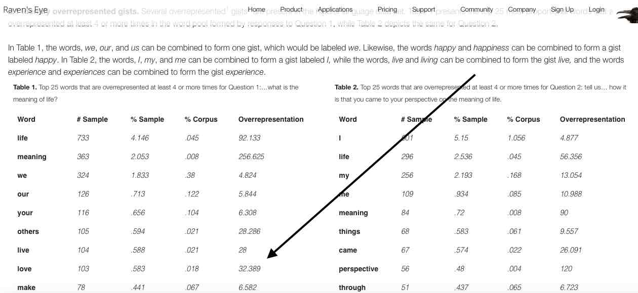
In order for the proportionality of the word love to become equal to its expression in the background corpus (i.e., in order for the Overrepresentation quotient to become 1.0), and thereby become not particularly associated with the stimulus producing the responses that contain it, we would need to increase our existing word pool by approximately 31 times its current size without acquiring any additional instances of the word. Given consistency in the average response length, this would necessitate acquiring an additional 548,000 words across 10,726 additional participants, each of whom must never mention the word love in response to the question. Given the word's frequency in the current pool, however, it becomes quite apparent that such a result would be highly unlikely, and one can then maintain a high degree of confidence that the word love is associated with this particular question about the meaning of life.
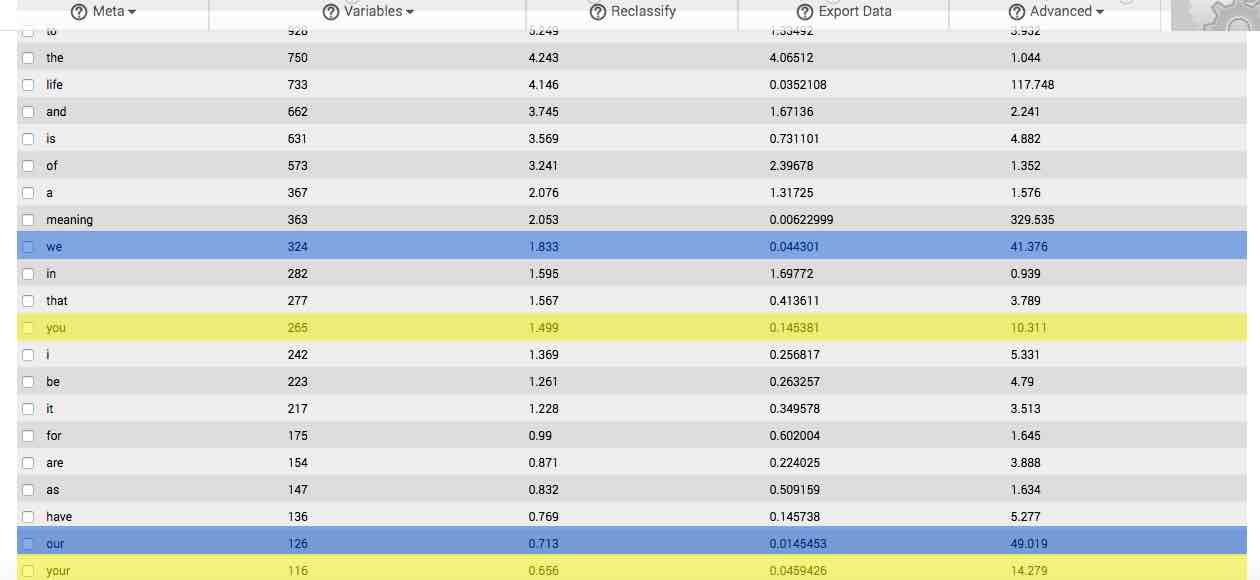
If one form of a frequently used word is overrepresented in your sample, then often times that word’s inflections, determiners, and synonyms will also be overrepresented. For instance, if the word, “hurry,” is both frequent and overrepresented in your sample, then such word inflections as “hurries,” “hurried,” and “hurrying,” are also likely to be overrepresented. Similarly, such synonyms as, “rush,” and, “hustle,” are also likely to be overrepresented. These inflections, determiners, synonyms and other related terms together elaborate on your basic gists to form what we define as concepts.
This can be seen in the image to the right, which depicts the main table resulting from analysis of the first question from our survey on the meaning of life. In the image, the first few gists forming the concepts we and you are highlighted in blue and yellow respectively.

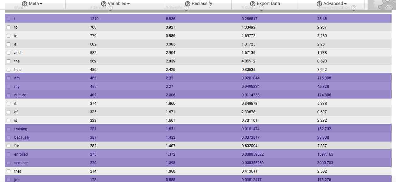
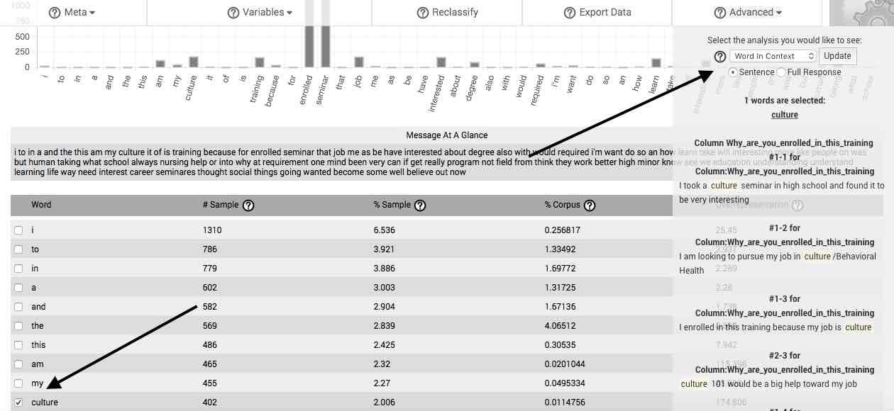
If your stimulus or question is specific and you have acquired a sufficiently sized sample, you will often be able to find phrases and complete sentences formed by reading downward the overrepresented words in the first column (the beginnings of such a sentence can be seen in the table to the right, which is based on responses to the question, “Why are you enrolled in this culture training?”). If such sentences are comprised of words from the first 50 or so listed by default in the table, then they likely represent the revelatory themes and essential structure of your response set, as expressed in the vocabulary of your respondents. We describe a standardized means of generating such themes and structures when discussing the features available in the Advanced menu button, below.

If the question or stimulus evoking the response is broad, as in, "Tell me about your life," or, if you are analyzing a large written work (such as a book) in its entirety, your responses will be comparatively broad. In these instances, it will be more difficult to quickly identify a well-constructed phrase or sentence in the first column, but the main gists and concepts will still be apparent.
If you require more specificity, you can either change your meaning units by subdividing your responses into subsections (such as sentences, paragraphs, or sections), or filter your cases by particular keywords and reanalyze your data, or ask a more specific question.
Menu bar additions.
When you receive the results of your analysis, six new buttons appear in your menu bar. These new buttons each correspond to different functional features available in Raven’s Eye. They are labeled Meta, Variables, Reclassify, Export Data, Advanced, and Generate Report.
We describe each button individually in this section, though several of their functions are also discussed in detail during subsequent pages of these Practicals, as well as in the steps of conducting a Quantitative Phenomenology with Raven's Eye.
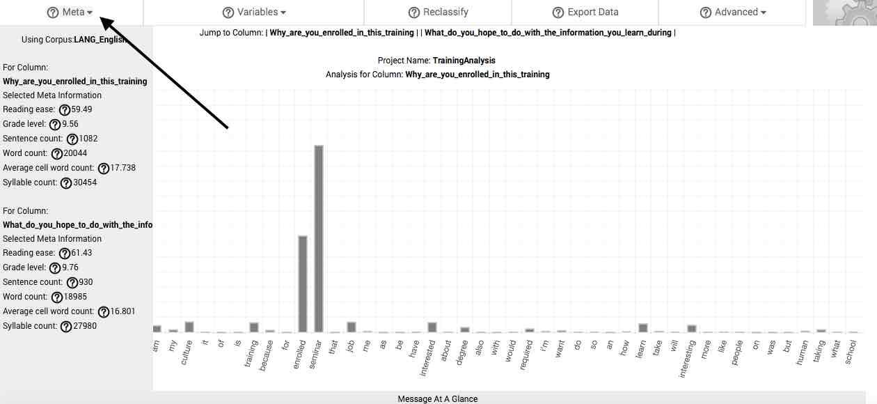
Meta.
The Meta button on the menu bar reveals information helpful in understanding the general context of your responses, or what we call geists. By clicking on the Meta button, the corpus you are using is displayed in a dropdown menu, with the following information about your response pool is revealed. If you have selected to combine your response columns, you will receive global information about the pool of natural language that you've uploaded. If, however, you have chosen to analyze your response columns separately, this information will subdivided according to each response column. Scrolling downward in the Meta dropdown menu reveals these.
Reading ease—this is the Flesch Reading Ease Score of your sample, or if selected, your subsample.
Grade level—this is the Flesch-Kincaid Grade Level of your sample, or if selected, your subsample.
Sentence count—this is the total sentences in your sample, or if selected, your subsample.
Word count—this is the total word count of your sample, or if selected, your subsample.
Average cell word count—this is the average number of words per cell in your sample, or if selected, your subsample.
Syllable count—this is the total number of syllables in your sample, or if selected, your subsample.

Variables.
By clicking on the Variables button in the menu bar, you can select particular states or classes of your variables to be compared against other states or classes of your variables. This is useful for comparing response patterns between such things as experimental conditions or demographic characteristics. The menu that appears when selecting this button is explained in detail in the Comparing your variables page of these Practicals.
Reclassify.
By clicking on the Reclassify button, you can alter your previous column classifications. For example, data that was previously excluded can now be selected and included as a response to be analyzed. The process of reclassifying variables is explained in detail in the Working with previously uploaded projects page of these Practicals.
Export Data.
By clicking on the Export Data button, the table of results currently loaded on your page is downloaded to your device in .xls format. The process of exporting your results is explained in detail in the Exporting your results page of these Practicals.
Advanced.
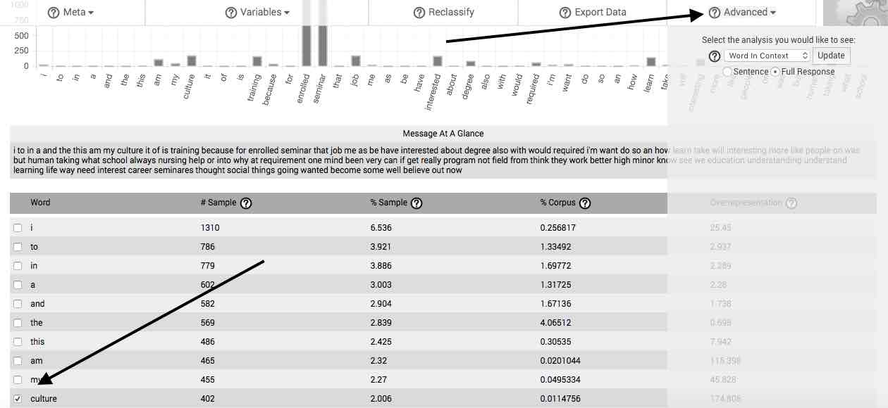
Clicking the Advanced button opens a dropdown menu with several options, which allow you to relate your concepts into revelatory themes and identify the essential structures in your response sets.
In order to utilize the features listed in the Advanced dropdown, you must first select a word in the main table. Additional words can be analyzed sequentially by first deselecting any currently selected words, then selecting a new word for analysis.
If you are analyzing more than one response column separately, the features listed in this section will return separate calculations for the selected word in each response column. Scrolling downward in the Advanced dropdown menu reveals these.

Word in Context—The Word in Context feature allows you to view each instance of a selected word or gist as it occurs in the context of your uploaded natural language sample. The context can be limited to the sentence in which the selected word occurs, or the entire response (or case).

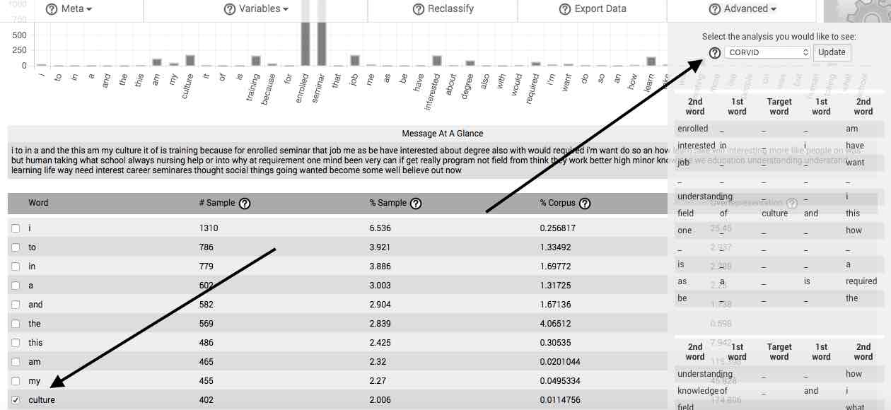
CORVID—The CORVID feature automatically produces the network of words or gists associated with the selected word or gist. After selecting a word in the main table, then selecting CORVID, from the Advanced menu, a table appears that contains the most frequent first- and second-order words surrounding the selected word or gist. Beneath this table is a graphical network representing the same information as is found in the table. Selecting the Expand CORVID button open a new tab in which the CORVID network for the selected word is expanded to fifth order word relations.
Right-click any CORVID network to download it to your computer as an image file.

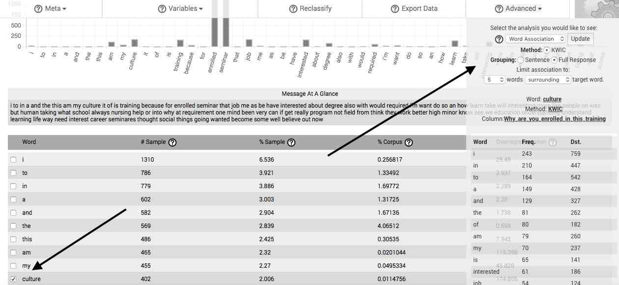
Word Association—The Word Association feature facilitates performance of what is commonly referred to as the Key-Word-in-Context (KWIC) method or procedure. After selecting Word Association, you may then determine whether to group the association by sentence or by full response (e.g., one full case). Once you have determined this, you may utilize two dropdown menus to decide to include up to the 10 words preceding, surrounding, or following the word selected in the main table. After doing so and clicking on the Update button, a table appears that lists the frequency of words or gists meeting your set criteria.

Generate Report.
The Generate Report feature is enabled for our enterprise-level clients with tailored service level agreements. Individual users utilizing the DIY retail subscription license can produce a selection of charts and graphs distilled from their spreadsheet data by clicking on this button.
For enterprise clients, selecting this button automatically generates the worldview manifested in the selected natural language data. Similar to those depicted in our online demonstrations, this worldview provides both graphic and verbal summaries of the data, as well as a selection of model statements.
For individual retail subscriptions, this report generates at once the charts and graphs already available at your fingertips by selecting the various functions in the current window. Since, however, the CORVID networks for this report are selected via a psuedo-random process from the top 50 words in the response set, individual subscribers may find this report useful for idea generation. Data sets must be in spreadsheet format and contain at least one variable for the Generate Report button to function in individual retail subscription versions of the software.
Cogs dropdown menu access.
The menu bar continues to provide links located under the moving cogs, which connect you to pages that allow you to create a new project, select an existing project, access settings or support, or sign out.
Working with multiple and separate response columns.
As noted previously, if your project has multiple columns classified as responses and you have chosen to analyze them separately, your results will be presented separately for each response column. These separate results can be found by scrolling downward in the Meta and Advanced dropdown menus. In the main chart and table area, links will be located between the top of the first main chart and the menu bar. These links (preceded by the stem, Jump to Column) will facilitate rapid downward scrolling and inspection of the main chart and main table for each response column.
Technical considerations.
More information about understanding and interpreting your results can be found in the Get a Sense of the whole, Constitute parts by identifying meaning units, and Transform data into revelatory statements pages of the steps in conducting a Quantitative Phenomenology with Raven's Eye. Additional methodological and theoretical details, can be found elsewhere in the Technicals.
Notes.
1 The text of the question was, "Over the course of a short paragraph (i.e., 3-5 sentences), please describe in your own words: what is the meaning of life?"